Most of us dislike used vehicle salespeople and aggressive pressure methods, yet gentler persuasive strategies can be much more effective.
Think of the understated Google Ads user interface. Although it appears to be a benign management tool, its deft design quietly influences user behaviour, helping the tech giant earn $224 billion in revenue in only one year.
Explore the subtle persuasion techniques Google Ads employs to make sure "the house always wins" and learn how to outwit the house.
Deceptive patterns, formerly known as "dark patterns," are manipulative design strategies that lead people to make decisions that are advantageous to the company.
These behaviours improve business KPIs, but consumers pay the price by making unintentional purchases, disclosing personal information, or spending unnecessary time navigating confusing interfaces and "screen mazes."
An whole class of unethical design methods are referred to as deceptive patterns. You may discover the following on the Google Ads interface:
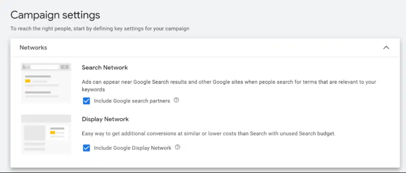
Your choices may be influenced by defaults and pre-set user preferences, so if you don't pay close attention, you can unintentionally accept something you don't want.
Google defines Search campaigns as “text ads on search results that let you reach people while they’re searching on Google.”

Location targeting defaults to include people who may be “interested in” (but have never been to) your target.
This setting is not immediately visible from the Location section. Not only do you need to uncheck it, but you have to know to un-nest it (click Location Options to expand) in order to uncheck it.
Some campaign types don’t even allow for the removal of “interested in.”
Leave a comment